Wednesday, January 31, 2007
Digital Sketch Book: Image Eight

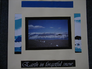
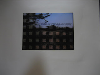
According to my plan I intended to create strips between the original and the manipulated image. However when I came to develop the idea in Photoshop, that technique worked better with Image One. Therefore I experimented with other techniques for this image. For example the colour balances, the colour mixer and the radial blur. For the radial blur I selected certain parts of the image, this wroked better than adding the affect to the entire image.
Digital Sketch Book: Image Seven
 Stage 2: Text - Cut Out Window
 I really liked the effect in the manipulated image as I used the original to create it but it looks completely different. After stage 2 I decided to make two windown (top and bottom) instead on one big window in the middle. I think the text matched the image particularly well.
Digital Sketch Book: Image Six


Stage 4: Duplicate Layer / Fill Bird & Text
This image was very simple concept but was complicated to set up, print and put together correctly. As you can see in the manipulated image, the black bird and the text was printed on acetate. This covered the bird in the original image behind it. On the second page the different coloured layers were stuck on foam board to give them a 3D look and some depth. In order for this idea to work, I had to make sure that the pages were printed and cut to exact measuremnets.
Digital Sketch Book: Image Five


Digital Sketch Book: Image Four
 Stage 2: Text
Initially I was going to print just the text and the twig on acetate, but after comparing I felt that the same image in colour on acetate would bring out the twig evern more. As you can see in the manipulated image, the original photograph is placed behind the acetate, and although the colours are the same, they have a different texture and depth on acetate. I really like this image.
Digital Sketch Book: Image Three
Digital Sketch Book: Image Two


Stage 3: Text
I used a simple manipulation technique of 'Posterize' to get this effect on the original image. Then on another layer I painted unwanted white parts black to make the bottom of the image more clear and defined. Then I added the text. As you can see in the photo, on the first page you can see the full panipulated image, and on the second page you can see parts of the manipulated image around the original. I really like this as it links the two pages together.
Digital Sketch Book: Image One

Manipulated Image
 Stage 1: Filter Effect 'Chalk & Charcole'
 Stage 2: Vertical Strips
 Stage 3: Horizontal Strips
 Stage 4: Text
For this image I started off by adding the filter effect 'Chalk & Charcole'. Then I duplicated the layer and cut horizontal strips on one and vertical strips on the other. This made transparent squares which show the original image behind. The manipulated image was printed on acetate.


