Thursday, May 24, 2007
Stage 6: Insert Architectural Objects

VR Stage 4: Stairs


VR Stage 3: Boolean Windows & Doors

To insert spaces for the windows and doors I started off by creating 3D boxes that were slightly bigger in depth than the walls. I then positioned them all on the model using the drwings as a guide to where the windows and doors are. Before I applied the bollean tool I added segments to all the walls. This made sure the structure was stable as when meshes are edited too much the model would collapse. Below is a screenshot of what the model looked like after the boolean tool had been applied.

VR Stage 2: Extrude 2D Splines
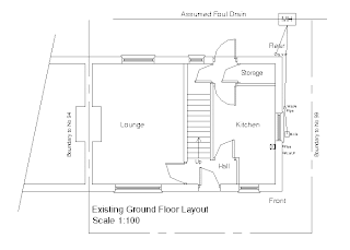
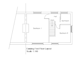
 I extruded the 2D splines to create the main structure of my house in 3D. I decided to model the existing house first and then use it as a basis create the proposed instead of modelling them both twice. I did not have measurements for the height of the house and therefore used the elevations as a guideline to estimate it. I kept the 2D drawings in the scene and positioned them on the model. This was useful for the placement of the doors and windows.
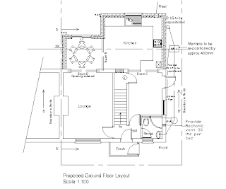
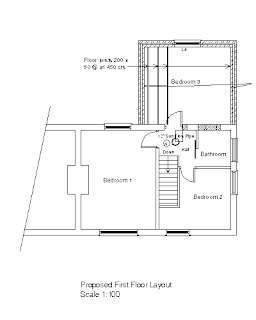
VR Stage 1: Trace 2D Drawings

Virtual Environments - Project Planning
* Import CAD Drawings
* Trace
* Extrude Add details: Windows/Doors/Furniture
* Textures
* Lighting
* Other Details
* Model Extention Animation or Create VRML
Virtual Environments - Project 2
For this project we were set the following brief:
Design, model and present a virtual environment based on an industry that you think will benefit by using 3D modelling, to convey a message or an idea, i.e. architecture, town planning or internet chat room etc.
From this I wrote the following individual brief:
Design and model a virtual environment for 96 Surrey Street and its proposed extension. Present research and reasons on how you think 3D and Architectural Modelling will benefit the industry of Residential Property Development and its consumers.


• To create a 3D model of the existing property
• To create a 3D model of the proposed extension
• To combine the existing and proposed 3D model to create a VRML walkthrough of the property or an animation of the extension
• Effectively demonstrate what the property looks like now and what it will look like after the extension
Wednesday, February 14, 2007
Treatment - Holding Pattern
- Underlying Themes and Issues
- Casting & Character Profiles
- Location Profiles
- Equipment
- Crew
- Mise-en-scene (Costume / Set / Props / Lighting)
- Sound
- Scheduling
- Rehearsals
- Administration
Pre-Production Documents
- Treatment
- Storyboard
- Film Production Overview Sheet
- Schedule
- Rehearsal Plan
- Lighting Plan
- Release Forms
- Recce Sheet
- Health & Safety / Risk Assessment
- Contingency Plan
Tuesday, February 06, 2007
Characterisation Exercise 1
Object: Book
Scenario: Reading a book, it late at night. Have to finish the chapter for lesson tomorrow. Falling asleep and can’t stay awake.
Blocking Action & Camera Shots:
- Sitting down at a desk, the lamp is on and there are cups of coffee on the side next to a pile of books.
- Close Up of eyes
- Medium shot to show the desk and the character’s back
- Birds-eye shot of book (blur / out of focus shot to show character is falling asleep and can’t concentrate.)
- Birds-eye shot of character flicking through the pages of the book (emphasising the chapter is still not finished)
- Close up shot of clock (diegetic sound of clock ticking)
- Medium shot of character with eyes closed leaning on their hand
- Close up of character awake and with a shocked expression (its morning and the chapter is still not finished)
Action Verbs:
These are some action verbs that could have been used to describe the ‘actable moments’ to the actor:
- Calculate
- Weigh down
- Suffocate
- Engage
- Complain
- Pressure
Directing Actors
- Organised
- Creative & Technical
- Autocrative / Authoritative / Democratic
- Visionary
- Self Motivated
- Entrepreneurial
Especially when working with actors you need to:
- Provide constructive feedback
- Earn actors’ trust and respect
- Understand different communication techniques
- Allow them ‘act’ rather than ‘do what you told them’
- Read through the script with them – Primary Blocking
- Make key notes (i.e. position, posture or even actor suggestions)
- Ask them questions and ask for questions from them
- Encourage actors to develop their character background
- Work through the script from ‘beat-to-beat’
Blocking
This means physically working out how the scene will work. This includes the positions of actors, the camera, the set and props.
Scene Descriptors
These are emotional events of a scene. These can be used as tools to generate appropriate beats and action verbs.
Action Verbs
These are words are very useful on set when trying to achieve a particular emotion from an actor. They describe an ‘actable moment’ clearly for the actor to ‘feel’ as a character and then act it out through the script. Below are some examples.

Facts
When directing an actor it is more practical to use facts in your explanation rather than psychologising. For example if you are explaining a particular scene and say “she can’t cry” is harder for the actor to ‘act’ that out. Therefore a simple fact like “she doesn’t cry” would be a more appropriate way of communicating your idea. In addition to this, describing what a character is or isn’t like complicates things further. A fact about what that character does illustrates the direction you are trying to achieve from the actor.
Characterising Beats
There are various types of beats that are involved with actors:
Plot Beats
- Story beat – progresses the story / plot
- Preparation beat – sets up the beginning of a sequence
- Expository beat – reveals information about the previous circumstances
- Crisis beat – reveals a problem or conflict in the story
- Mood beat – presents an emotional circumstance
- Reversal beat – reverses an action
Character Attitude Beats
- Dispositional beat – reveals a personality trait
- Motivational beat – expresses desire and provides reason for actions
- Deliberate beat – expresses a reflective or emotional thought
- Decisive beat – indicates a significant decision
Character Thought Beats
- Emotive beat – expresses what a character feels
- Reflective beat – expresses what a character concludes considers or discovers
- Informative beat – presents information relevant to the film
- Exaggeration beat – expresses maximising or minimising of a topic
- Argumentative beat – contains a conflict or problem
[Lecture Notes: Julius Ayodeji - 13/11/06]
After reading the script I felt the story is about a Romanian character named Bogdan who is unemployed and currently living in the UK. He makes various attempts to apply for a job to earn a living. Bogdan is not very fluent in English however seems to be an intellectual and bright person. He has very less money and is awaiting a reply from the unemployment office at the local council. He receives a letter from the council and is left unemployed and homeless.
This script really appealed to me because of various factors. Firstly there is not great detail about the set or the actual plot. The script leaves many parts to the reader’s imagination to interpret in their own way. I feel this is a good thing as it will allow me to use my own interpretation of the story and develop it from script to screen. Also there is no dialogue in the script. Once again I see this as a positive factor as it will obligate me to use visual grammar to convey the story instead of speech. Based on my interpretation the script can have a linear or a non-linear narrative structure, which gives me more room to experiment with developing the beginning middle and end. The script has different locations; I see this as a challenge as there will be different shooting conditions at each location. Bogdan is the only character in the film, therefore his character can be developed more as it is a short film and there is limited time. Finally I feel that the subject of unemployment and immigration is interesting and can be explored and developed to give a particular message to the audience.
Units & Beats - Intro
The dramatic unit is a particular section of the film where :
- A problem is highlighted
- The obstacles that prevent the solution are overcome
- A change occurs
- A resolution is found.
This resolution may highlight further problems; hence another dramatic unit has begun. This cycle continues until the ultimate resolution has been found.
The Beat
The beat is a significant part of the dramatic unit can be described as ‘a moment of changed awareness’, which is normally a result of a decisive moment in the plot. This realisation can happen to a character or the audience (when they understand more than the characters in the story – another form of dramatic irony). These audience / character / plot beats can be used to prepare guidelines or steps for actors to follow.
Discuss ‘WANL’
1. What was the vision?
2. What are the underlying themes?
3. How are these ideas / themes are visually represented?
The main plot of the film was about a script writer working on a project. After watching the films and doing the exercise I learned that although the plot was the same, and almost all of the dialogue was the same, each film was very different in its own way. Each version had a different approach in terms of mise-en-scene, mood, environment, atmosphere, framing and direction. In addition to this, even though the actor was playing the same role, he was a completely different character and personality in each film. Therefore a story can be interpreted and portrayed in various ways, which can be dependant on the storyteller and the techniques used to illustrate it in the form of a film. It will be interesting to see how the scripts that our year has been given to produce will be developed into different versions.
Week 12: Production & Direction for Camera - Intro
During the first term we will cover creating and developing story structure, rehearsal processes, working with actors and ‘screencraft’. This involves seven basic aspects of putting together a scene – ‘Seven Visual Blocks’: space, line, tone, shape, colour, movement and rhythm. In the second term we will study the seven visual blocks in further detail and also discuss approaches to shooting, editing and basic production techniques. Finally in the third term we will mainly be concentrating on producing the final edit of our film and all the documentation to go with it.
We have been given five different scripts to read, out of which we need to choose one to produce and direct.
Thursday, February 01, 2007
Digital Sketch Book: Final Product Opinion
In terms of improvement I think I could have reserached further into film festivals and added an extra feature of the festival to the posters (e.g. competition). With the image essay I could have printed the images slightly larger as they looked a bit small on the 12x12" card.
Wednesday, January 31, 2007
Digital Sketch Book: Image Eight

According to my plan I intended to create strips between the original and the manipulated image. However when I came to develop the idea in Photoshop, that technique worked better with Image One. Therefore I experimented with other techniques for this image. For example the colour balances, the colour mixer and the radial blur. For the radial blur I selected certain parts of the image, this wroked better than adding the affect to the entire image.
Digital Sketch Book: Image Seven
 Stage 2: Text - Cut Out Window
 I really liked the effect in the manipulated image as I used the original to create it but it looks completely different. After stage 2 I decided to make two windown (top and bottom) instead on one big window in the middle. I think the text matched the image particularly well.
Digital Sketch Book: Image Six


Stage 4: Duplicate Layer / Fill Bird & Text
This image was very simple concept but was complicated to set up, print and put together correctly. As you can see in the manipulated image, the black bird and the text was printed on acetate. This covered the bird in the original image behind it. On the second page the different coloured layers were stuck on foam board to give them a 3D look and some depth. In order for this idea to work, I had to make sure that the pages were printed and cut to exact measuremnets.
Digital Sketch Book: Image Five


Digital Sketch Book: Image Four
 Stage 2: Text
Initially I was going to print just the text and the twig on acetate, but after comparing I felt that the same image in colour on acetate would bring out the twig evern more. As you can see in the manipulated image, the original photograph is placed behind the acetate, and although the colours are the same, they have a different texture and depth on acetate. I really like this image.


