Showing posts with label V: Image Manipulation. Show all posts

Saturday, December 13, 2008

SPP3 - Creating My Brand

The objectives of this module are based around how this degree can be put into practise after graduating. I see it as a way of forcing you to think of what you will do after university. This particular assignment is about branding yourself and compiling material that can be used as tools to sell yourself. Critical ingredients of a brand include a logo and a colour scheme and in order to design these I first needed to establish what I want this brand to say. What connotational messages do I want my logo and colour scheme to send to my audience - potential employers? I wanted to say the following things:

- Organised
- Creative
- Multimedia
- Management
- Professionalism
- Cultural
- Belief in respect
- Belief in reaching for the sky
- Strong and bold
- Technical - production skills


These were aspects that I wanted to be reflected throughout the assignment - in the showreel and on-line portfolio. Amanpreet Budesha is on the Online Environments pathway and is focusing her final year around Brand Identity. Through consultations with her and experimental designs I established a colour theme and also designed a personalised logo.


I felt that this logo represented me as a person, my values and what I believe in. I think that it also portrays a creative and professional persona that can be carried through my creations as a brand identity.

Tuesday, October 21, 2008

Independent Charity Work


I was approached by a friend who is organising a charity Fashion show in Leicester. She required some marketing material to advertise the event. I took this as an opportunity and did a mini client project with her. She gave me a brief with requirements and all the information that needed to be advertised to the target audience. She gave me the following details:

Even Name
Date and time
Location
What the event will include
Contact details
Logos
Colour theme: Cream and Red

From this brief and a few e-mail conversations I decided to produce an A3 poster design, an A6 Flyer and an A6 ticket design. In the beginning I gave her 6 options, 3 of them were according to her colour theme and in three of them I had added another colour to the theme – black. Below are a few of the options I gave her, she decided with design 2.

Design 1

Design 2

Design 3

Design 4

Design 5

Design 6


I developed her chosen idea into three promotional pieces: poster, flyer and ticket. Although the layout, design and theme were exactly the same on all three each one had slight differences to fulfil its purpose, for example, the ticket design had a small box to writ in ticket numbers and also detailed information on the address of the location. The poster and the flyer were very similar, below is the ticket and flyer designs that were sent to the printers.


Through this project I had built a relationship with the client, as this was voluntary I had to fit it in with my other commitments such as a part-time job and university. However my client understood my circumstances and was flexible about how quick I delivered the designs, even though she needed them urgently.
Thursday, February 01, 2007

Digital Sketch Book: Final Product Opinion

Overall I felt the work that I produced was of a quality standard. The printouts came out really well and the posters looked professional. Above all I met the breifs that were set for us.

In terms of improvement I think I could have reserached further into film festivals and added an extra feature of the festival to the posters (e.g. competition). With the image essay I could have printed the images slightly larger as they looked a bit small on the 12x12" card.

Wednesday, January 31, 2007

Digital Sketch Book: Image Ten


Original Image


Manipulated Image


Stage 1: Adjustments - Curves


Stage 2: Filter - Water Paper Effect

I used the 'Curves' feature within adjustments to darken the colours in the image, I then added a filter effect. This didn't make much of a difference it just distorted the pixels slightly. Next I added a 'Zoom Blur', this blurred the defined lines.

Digital Sketch Book: Image Nine


Original Image


Manipulated Image


Stage 1:Mirror Image


Stage 2: Invert Image


Stage 3: Blend Change - Darken / Text


Digital Sketch Book: Image Eight


Original Image


Manipulated Image


Stage 1: Colour Balance


Stage 2: Colour Mixer


Stage 3: Filter - Radial Blur

According to my plan I intended to create strips between the original and the manipulated image. However when I came to develop the idea in Photoshop, that technique worked better with Image One. Therefore I experimented with other techniques for this image. For example the colour balances, the colour mixer and the radial blur. For the radial blur I selected certain parts of the image, this wroked better than adding the affect to the entire image.

Digital Sketch Book: Image Seven

Original Image


Manipulated Image


Stage 1: Filter - Liquify - Mesh

Stage 2: Text - Cut Out Window

I really liked the effect in the manipulated image as I used the original to create it but it looks completely different. After stage 2 I decided to make two windown (top and bottom) instead on one big window in the middle. I think the text matched the image particularly well.

Digital Sketch Book: Image Six

Original Image


Manipulated (1)


Manipulated Image (2)

Stage 1: Adjustments - Threshold


Stage 2: Cut/Paste Selection & Fill Colour

Stage 3: Duplicate Layers & Fill Different Colours


Stage 4: Duplicate Layer / Fill Bird & Text

This image was very simple concept but was complicated to set up, print and put together correctly. As you can see in the manipulated image, the black bird and the text was printed on acetate. This covered the bird in the original image behind it. On the second page the different coloured layers were stuck on foam board to give them a 3D look and some depth. In order for this idea to work, I had to make sure that the pages were printed and cut to exact measuremnets.

Digital Sketch Book: Image Five

Original Image


Manipulated Image

Stage 1: Colour Balance - Sepia


Stage 2: Filter - Artistic - Dry Brush &Text
I wanted to aheive a 'sepia' look to this image, so I altered the Colour balance by decreasing the amount of red. Then I added the artistic filter 'Dry Brush' to make the image look like it was painted. Finaly I added the text.

Digital Sketch Book: Image Four

Original Image


Manipulated Image

Stage 1: Twig Outline & Fill


Stage 2: Text

Initially I was going to print just the text and the twig on acetate, but after comparing I felt that the same image in colour on acetate would bring out the twig evern more. As you can see in the manipulated image, the original photograph is placed behind the acetate, and although the colours are the same, they have a different texture and depth on acetate. I really like this image.

Digital Sketch Book: Image Three

Original Image


Manipulated Image

stage 1: Create Orange Layer & Sun


Stage 2: Develop Sun in Image

This image was very simple, I was trying to emphasise the boldness and power of the sun. I felt this was well reflected simply with a yellow circle. As you can see in stage one I attempted to create an image of the sun but it looked too artificial.

Digital Sketch Book: Image Two


Original Image

Manipulated Image


Stage 1: Posterize Effect


Stage 2: Paint Unwanted White


Stage 3: Text

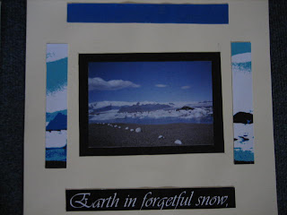
I used a simple manipulation technique of 'Posterize' to get this effect on the original image. Then on another layer I painted unwanted white parts black to make the bottom of the image more clear and defined. Then I added the text. As you can see in the photo, on the first page you can see the full panipulated image, and on the second page you can see parts of the manipulated image around the original. I really like this as it links the two pages together.